DESIGNER'S CHOICE
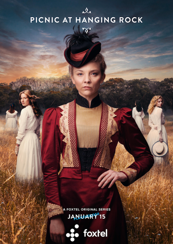
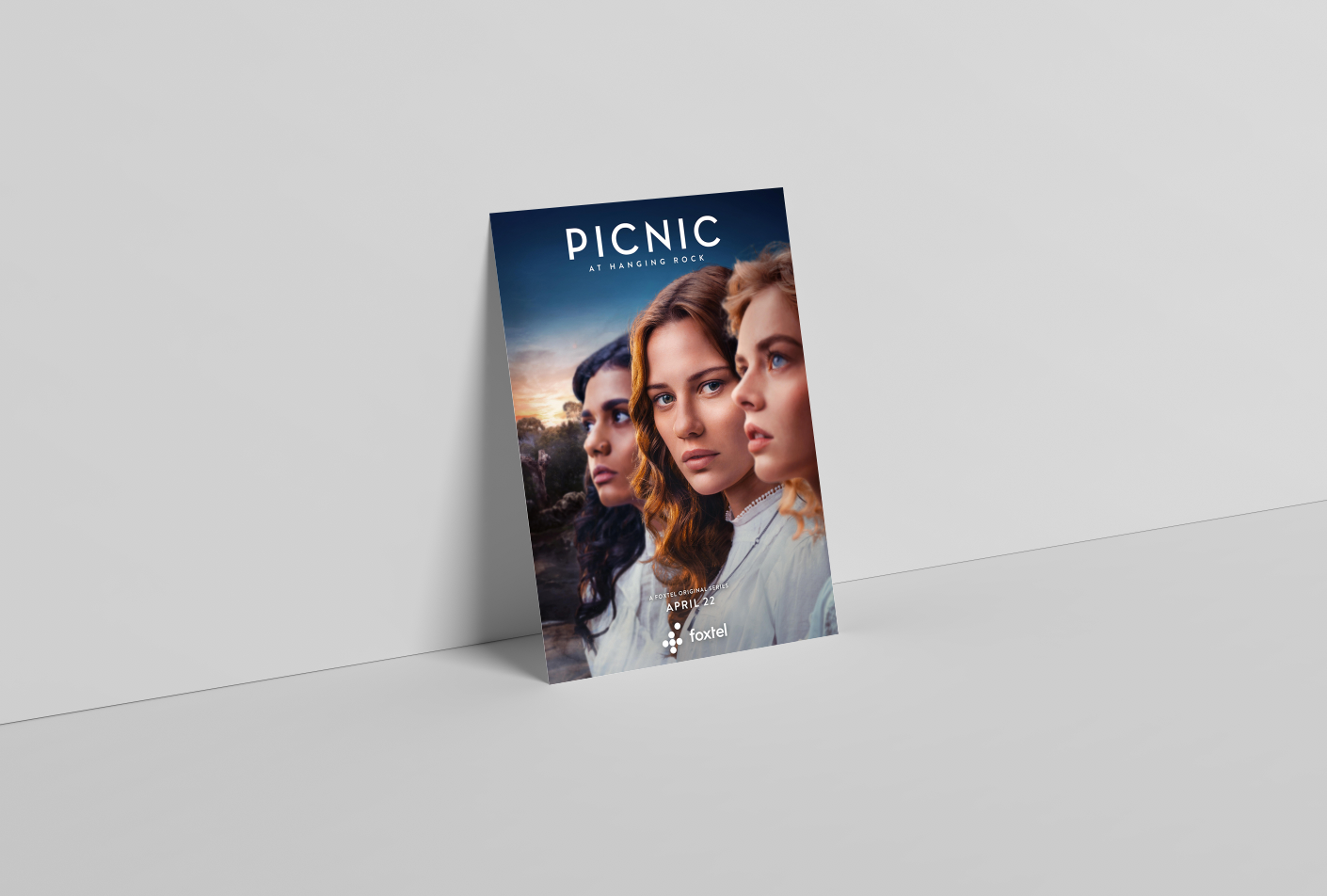
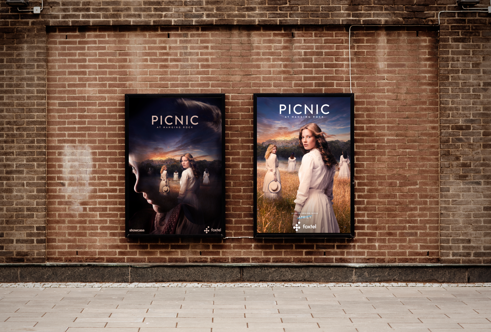
This Key Art was developed for Foxtel's local production and original Series, Picnic at Hanging Rock. This execution was my favourite artwork, and the one that I spent most time on. The composition of the background was created from scratch, as well as in Lightroom editing and grading of all imagery and retouching of the girls.
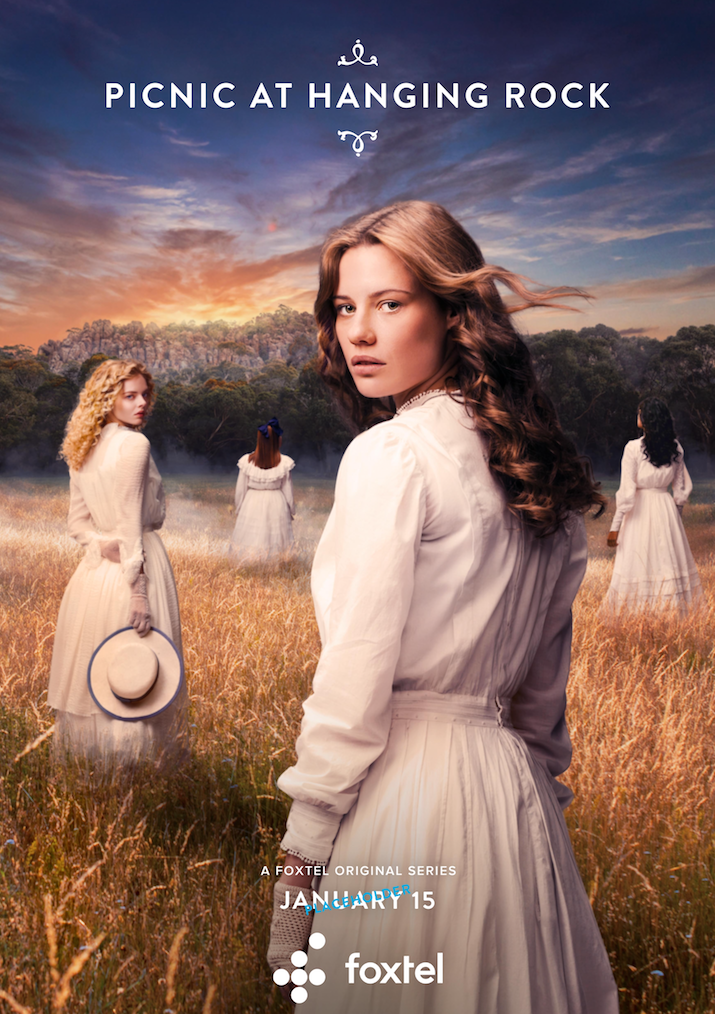
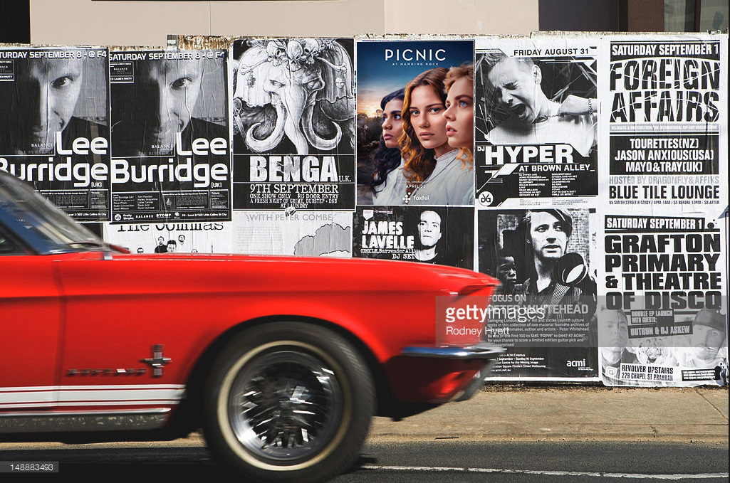
Although this key art was modified in another round of changes this remains my favourite work in progress. Please find the final execution for OOH marketing in Australia at the end.
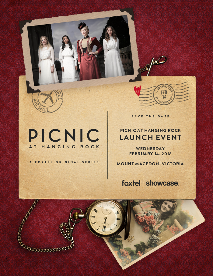
The concept behind Picnic at Hanging Rock (PAHR) began with a style brief provided by Foxtel’s local production team. The show was commissioned by the executive director of television, to re-create the iconic Australian film directed by Peter Weir into a dark, contemporary and lavish six part mini series mystery, exclusive to Foxtel. The early conceptualisation of PAHR aimed to appropriate the soft, poetic nature of the original film, into a starkly different, modernised, fast paced ‘nightmare’ for the modern audience.
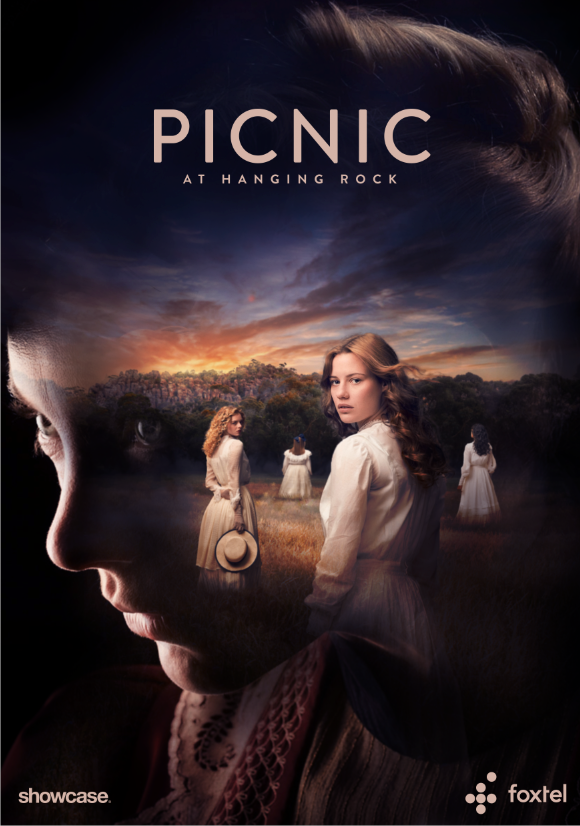
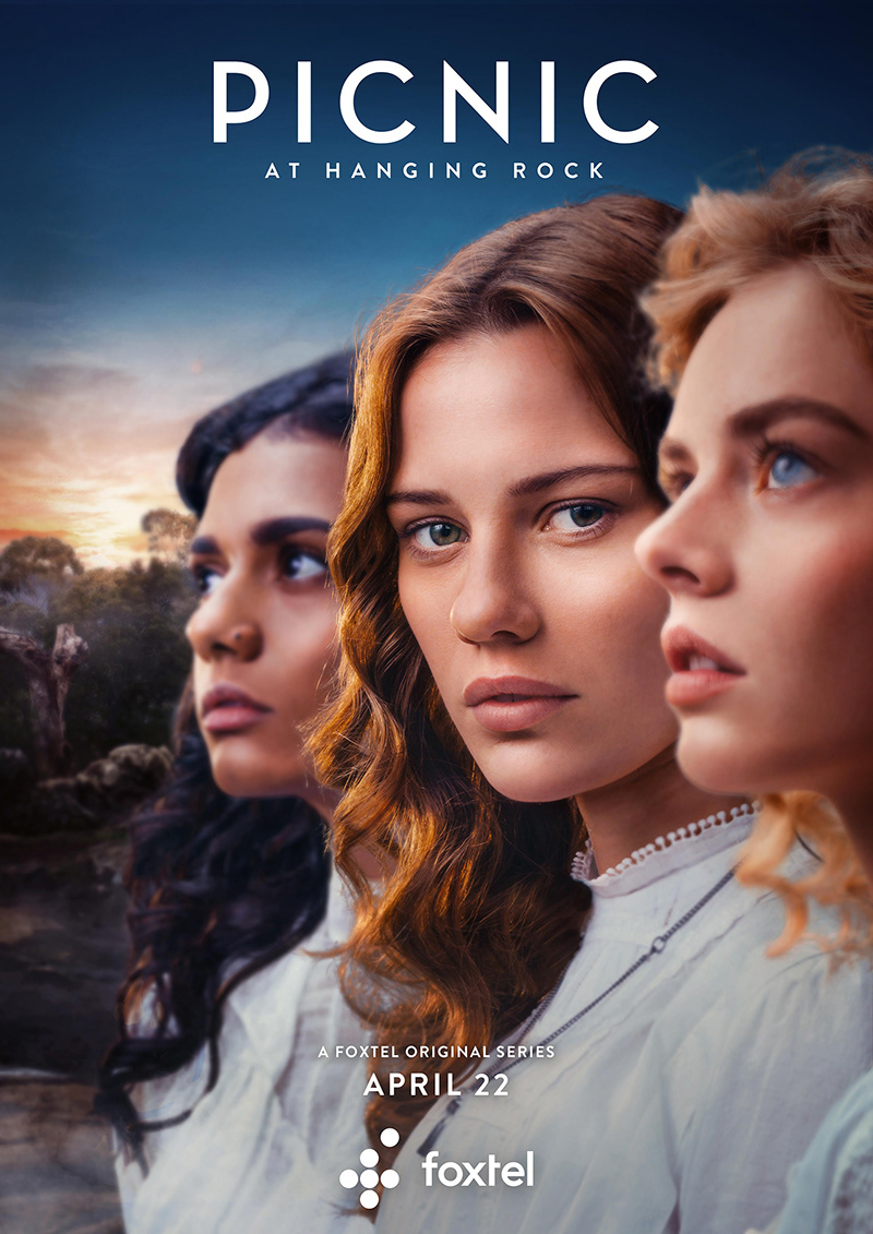
From these notes we developed concepts which focused on the girls, more than the ‘rock’ itself, to symbolise the female adolescent fire and desire to develop into independent women, in an era that was still oppressed by traditional Victorian views. A lot of the designs were executed in dark and moody tones, one concept in particular using the silhouette of Natalie Dormer’s profile to create shadows and an overwhelming feeling that somebody was always watching or that nature would take it’s own course. When collaborating with the marketing team, we found that marketing also had their own idea of Key Art, being a lighter, more sellable execution likened to more rich tones of the Australian sunset and the soft but piercing gaze of the three girls.
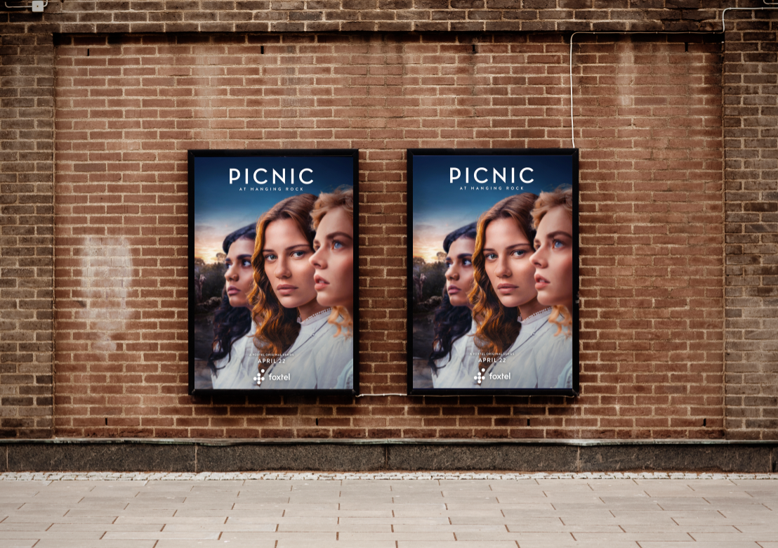
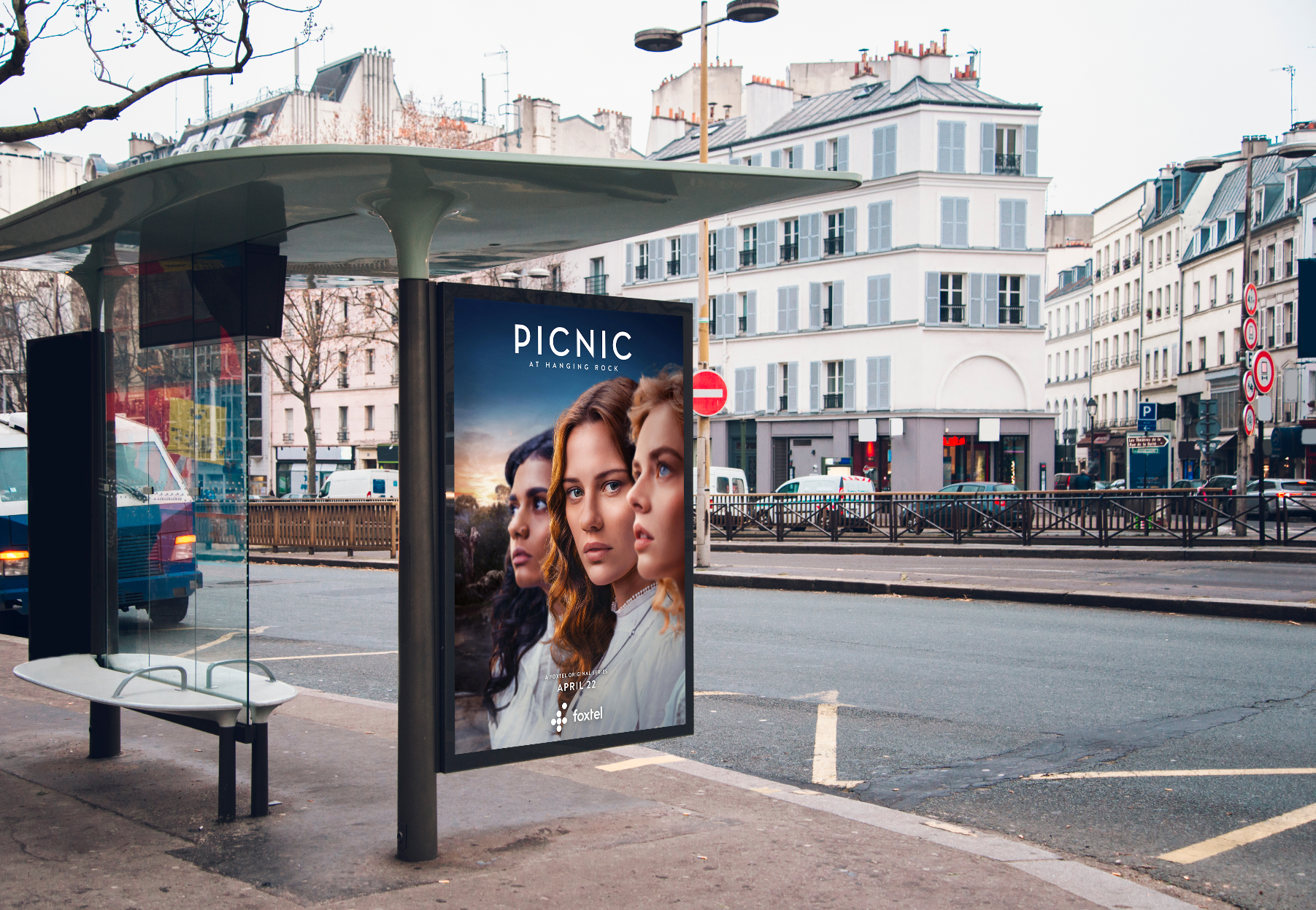
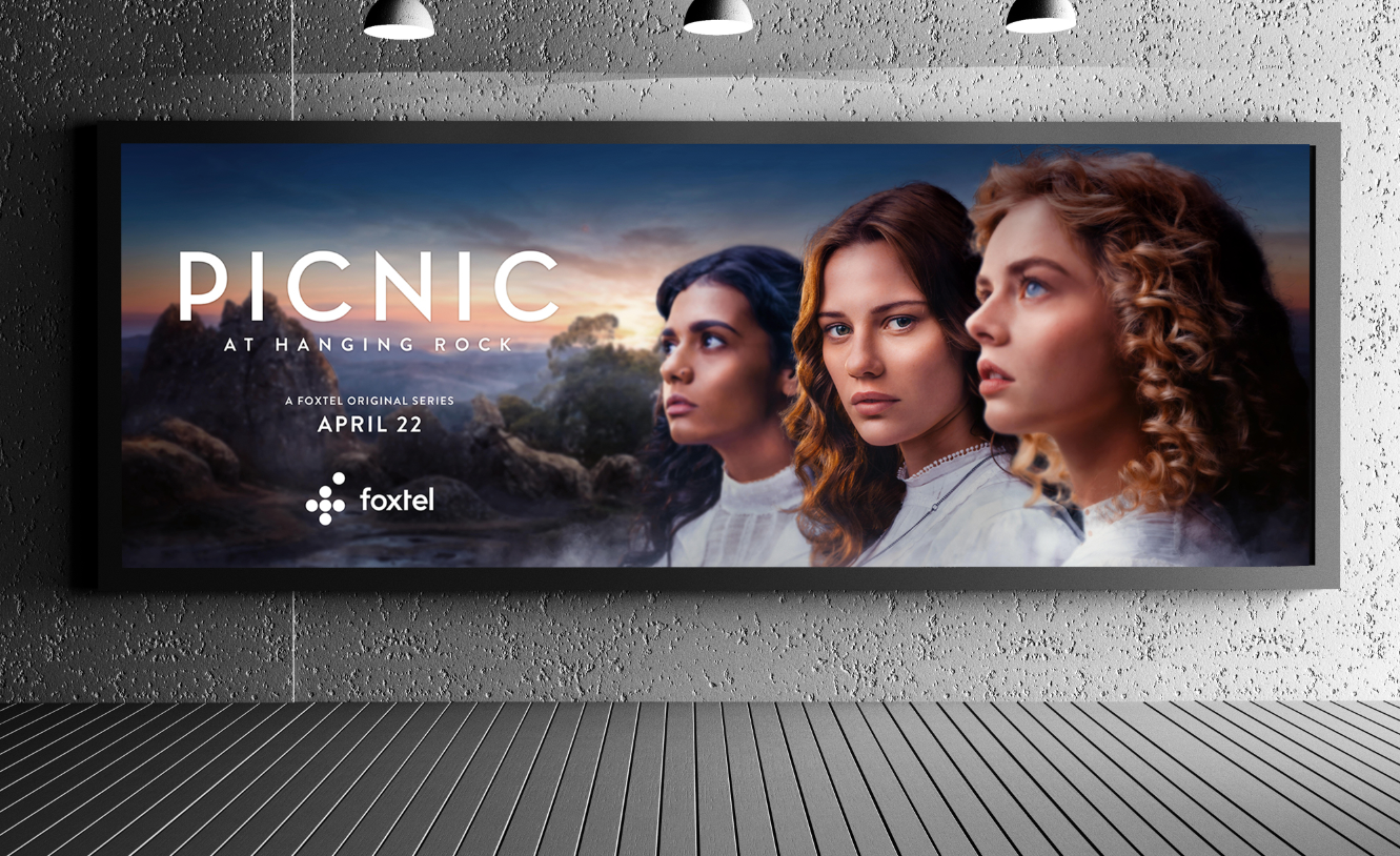
Through a process of reforming these ideas into a concept that both production and marketing team were happy with, we developed the concept of the three girls looking towards the hanging rock. Being up-close and personal, eye contact connects with the audience and passer-bye, to question the key art and ask what the girls are in awe of. We played with this idea using Lenticular screens, where the girls would disappear at certain angles when walking past, as well as digital screens in Westfields where the girls would spin across the screen to disappear into other characters or smoke. The final key art from the brief was stripped back even further, using a pink and blue sky to reflect the director’s intense use of colour and contrast in the re-make. This eye-catching key art is succinct at attractive attention and question to ultimately drive audience views.